|
I am going to take a quick post to look at my painting process. I don't really use any special tricks of my own, I use a huge collection of borrowed techniques, processes and theories. So keep looking around online at tutorials and pick up as much as you can. I recently worked on the Bloat Thrall from Privateer Press. Cephalyx mercenaries are allowed to field a few Cryx models, so I chose this ugly bastard: 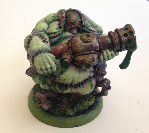 The first steps I go through with any model is to decide the mood or theme I would like to achieve. In many cases the theme is fairly apparent. Like this guy is an undead bag of corrosive ooze with a hose attached to his back that loads the cannon with his own bile waste. So I'm probably not going to attempt to make him regal and dignified. I find the most important aspects of creating mood is your color pallet and lighting. As far as lighting goes, I don't have enough confidence, skill or patience to attempt to paint direct light sources onto my minis. So I stick to natural lighting for my models. This is a relatively easy method to build depth and realism on your model. The idea is to darken the areas facing the ground and lighten the areas that face the sky. This attempts to emulate local or sky lighting as well as bounce lighting from the ground. This is a great way to define the large forms of the model and really brings out the three dimensionality of the mini. There are many more nuances and principles to lighting that can add a lot of drama to your mini. So read up on light and how it interacts with forms to really get a strong grasp of what you can accomplish with different lighting schemes. I will be attempting to paint a light source on the terrain piece I am currently working on, so stay tuned for that break down. On to color. Color theory goes way beyond what I am going to go into here, so of course, go out and do some research. For most of my miniatures, I tend to paint what is called a 'complimentary' color pallet. With this pallet you use two colors that are on opposite sides of the color wheel. For example, orange is the complimentary color to blue, as is yellow to purple. This pallet gives you the most contrast between your colors while remaining naturally pleasing to the human eye. I find with working at this scale it is very important to have the forms read as clearly as possible yet still harmonize with the rest of the model. Complimentary pallets and natural lighting are simple and very helpful ways to bring your model to life. Painting: So to start, I knew I wanted a lot of rotten green colors happening on this model. I figured a green tint to the skin and a fair amount of saturated green ooze seeping out of him would hit the mood I wanted. Using the complimentary theory, red is going to be my second color. I figured in the end I could rust up the metal areas to bring reds into the model. Also, brass typically has some red hue to it, so I figured I would let some dominate areas be brass. The helmet and end of the cannon would work well for broad areas of my complimentary color, so I will do those as brass. I decided the main part of the cannon and all the tubing I would be a dark metal and I could dapple rust on them to make it blend. I primed the model with a blue-grey primer. When it dried I used a dark brown wash in all the crevasses of the stitching, the deep areas or seams where the skin meets another surface and finally along the seams of the metal. This creates a nice effect know as self occlusion. This emulates the appearance of light diminishing as it bounces into non-illuminated areas. It's nice to do this before the base coat so you can get these darker areas from the start. For the skin, I mixed a very pale flesh tone, then added a small amount of green. This made for a nice start to the undead skin and I was hoping it looked like you could see the translucency of the bile under the skin. For my metals, I start with a base coat of the color that I want the metal to take on. This layering will build up color into your metals. I find that metalic paints don't usually give very much hue to the model, so this will help with that. I laid down Cryx Bane Green for any dark metal surface and Sanguine Red Base for the brass. 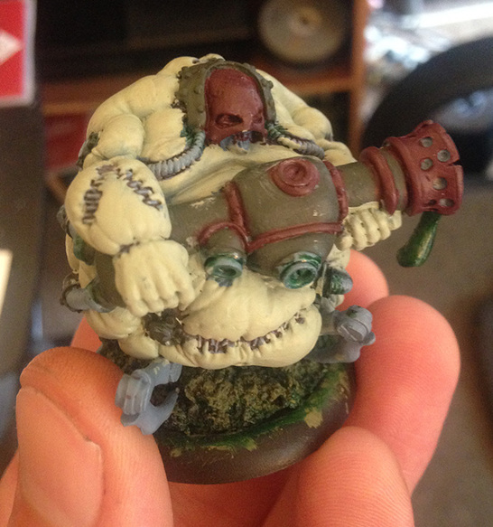 My next step is something I don't use on every model, but it makes a great weathered or beaten effect on skin and leathers. I know it as tinting. I wanted to produce bruising along the skin where the metals are attached and where the skin is sewn together. To accomplish this effect, I used a heavily watered down beaten purple. I loaded up a brush and tapped the excess off with a paper towel. Lay the brush down where you want the effect heaviest and let the paint settle then pull away from the seem and the paint will naturally diminish to colored water. You want to apply your tinting before your shading to keep everything blended. I then added some green ink in areas where I thought ooze might spill out of the stitching and plugs. I added my first coat of brass to see how it looks. I painted the dark metal areas as well but did not photograph at that point. 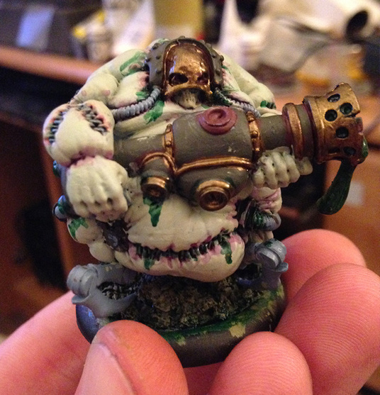 Once you're satisfied with the results of your base coat and any effects you used, it is time to move onto shading. At this point, the model should look pretty cool and start to take on the theme you are looking for. But it looks kind of flat and cartoon like. Shading is a process of painting dark area on the model to define the form of your figure. This is part of the process of lighting your miniature. The idea is to use a wash or watered down paints to darken the color of your base coat where the shapes fall into darkness. If you are attempting to paint a direct light source onto your model, this is how you define the shadows. You can also use this step to create the bounce lighting on your model, that is lighting that is "bounced" off the ground or other surface and onto the non direct lit surfaces of your model. For the Bloat Thrall, I had read a good tip for shading undead skin a pasty blue. I mixed a very thin, pale blue. I added darker values until I had a nice medium darkness to the color. It has to be fairly darker than the base skin, but not too dark or it will look unnatural. I use a similar painting technique as the tinting, but in much broader areas and much thicker. The semi-translucence of the paint or wash allows you to build up a few layers during this process. Allow the wet paint and washes to seep into the deep areas of the model and spread the pooled paint out from the corners and crevasses. Use more on the under side of the model than on the top. I made the shading at the bottom of model heavier and even a little darker. This exaggerated the depth of the model by creating planes of separation of the light hitting the miniature. I used armor washes and mixes of green and brown inks in the same process on the metal surfaces. The last step I take a model through is the highlighting. This is really what make the model pop.
1 Comment
Mike
6/24/2015 05:18:38 pm
I dunno. I think you should've gone the regal route. He looks the princely part! Looks great BTW! Leave a Reply. |
AuthorI am a 3d Lighting artist for games, commercials and film. I paint miniatures and build scenery as a hobby. CategoriesArchives |
 RSS Feed
